 As many of you already know, the Web Content Accessibility Guidelines (WCAG) recommend a specific amount of contrast between backgrounds and text on your websites. Unfortunately, very few people probably actually test their websites to ensure that they meet those guidelines. As a color-blind person, I find a lot of websites that are extremely difficult to read because of poor contrast between backgrounds and text.
I’m honestly not sure why many of us (including myself, on many occasions) don’t check the color contrast on our websites. While it’s difficult to measure and quantify the contrast through conventional means, there are quite a few really nice tools that make it a snap.
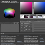
The tool I’ve found most useful is called Contrast-A. Contrast-A is available as a Web-based application and as an Adobe AIR application, so it can easily be used on all platforms. To use Contrast-A, you simply enter one color value (in hexadecimal or RGB), then enter the second color value. Contrast-A will then show a sample of the first color as a foreground and the second color as a background, and vice-versa. Samples of larger text (18px or larger) and normal text (~12px) are shown in the display, along with a color wheel.
Then, below the samples, is information about the contrast between the two current colors and a simple checklist letting you know if the two colors have enough contrast to meet the WCAG recommendation. Finally, Contrast-A even includes a color-deficiency simulator to attempt to let you see how the contrast appears to users with various color-deficiencies.
Contrast-A is a very handy tool, offers a great amount of information and is extremely simple to use. If you are not contrast-testing your website with a tool like Contrast-A, you really should be. As a color-blind user, I implore you to do proper contrast-testing to make it easier for me to use your sites.
Post Your Comment