Definition lists (dl) can be somewhat of a bear when trying to style them nicely. Because of the fact that the term/definition sets don’t have any kind of wrappers, you can’t successfully and reliably float them to place the terms on the left and the definitions on the right (however, once CSS2 and CSS3 selectors become more widely supported, you should be able to get more control).
However, you can do some nice things with definition lists. This article will show two examples of how definition lists could be used on your site and how to style them nicely.
Navigation
 One thing you can do with a definition list is create your navigation menu. For the most part, coders seem to rely heavily on unordered lists for navigation menus, but a definition list might make more sense. Think about a typical WordPress sidebar. It includes a header and a list of items that relate to that header. Doesn’t it make sense to think of the header as a definition and the list of items as the definitions for that term?
This makes even more sense when you have specific sets of navigation items. For instance, if you have a “quick links” menu, a task-based navigation menu (link titles that describe tasks or goals that will be accomplished by clicking the link) or an audience-based navigation menu (link titles that relate to the specific type of visitor being targeted by the content being linked).
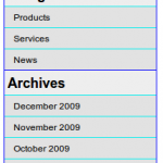
For a sidebar, you would simply use some CSS to style the definition term (dt) the way a header would be styled and some different CSS to style the definition (dd). Using a definition list in this instance will produce much cleaner HTML than the nested unordered lists generally found in WordPress (though, to implement this in WordPress, you might actually have to modify some base functions in WP itself). In fact, if you want to hide the header altogether, you can do so more easily with a definition list than with an unordered list. Simply use CSS to set the “display” property of all dt items in the sidebar to “none.”
Your sidebar menu might look something like:
<div id="sidebar">
<dl>
<dt>Categories</dt>
<dd>Products</dd>
<dd>Services</dd>
<dd>News</dd>
</dl>
<dl style="border-bottom: 0;">
<dt>Archives</dt>
<dd>December 2009</dd>
<dd>November 2009</dd>
<dd>October 2009</dd>
<dd>Older</dd>
</dl>
</div>
and your CSS for that might look like:
#sidebar {
width: 200px;
background: #eee;
border: 1px solid #00f;
}
#sidebar dl {
margin: -1em 0 0 0;
padding: 0;
border-bottom: 1px solid #00f;
}
#sidebar dt {
font-size: 1.5em;
font-weight: bold;
margin: 0;
padding: 1em .25em .25em .25em;
}
#sidebar dd {
margin: 0;
padding: .5em 0 .5em 1em;
background: #e2e2e2;
border-top: 1px solid #0ee;
}
Timelines and Date Lists
 Another practical use for definition lists would be to use one for a timeline or a list of items organized by date. For instance, going back to the WordPress example, you could use a definition list to display a list of posts according to the date on which they were published. The dates themselves would be represented as definition terms (dt) and the post titles and excerpts would be represented as definitions (dd). You could then apply some fancy styling to the dates and format the titles and excerpts however you choose.
When creating a timeline recently, I used a definition list and added some CSS to make it look rather nice. Following is an example of the code I used.
<dl>
<dt>1979</dt>
<dd>I was born</dd>
<dd>I was baptized</dd>
<dt>1981</dt>
<dd>I started preschool</dd>
<dt>1984</dt>
<dd>I started kindergarten</dd>
<dt>1996</dt>
<dd>I graduated high school</dd>
<dd>I started college</dd>
<dt>2002</dt>
<dd>I got married</dd>
<dt>2003</dt>
<dd>My daughter was born</dd>
</dl>
I then used CSS similar to the following to make the years really stand out and to make the milestones look like bullet items.
dl {
margin: 0;
padding: 0;
}
dt {
font-size: 1.5em;
font-family: serif;
font-weight: bold;
margin: .5em 0 0 0;
padding: 0;
}
dd {
display: list-item;
list-style: square;
list-style-image: url(bullet.gif);
margin: 0 0 0 2em;
padding: .5em;
}
These are some very quick, dirty, simple examples. With a little extra effort, I’m sure you could come up with something much nicer and better designed. Give it a shot the next time you’re working on a project.
4 Responses
This would also be a great format for a Faq! It really separates the topic and the definition in a way that is not cluttered yet is clearly defined. Thanks!
Thank you for this! Needed that display:list-item piece, which I haven’t seen anywhere else.
Just testing. It seems your site pulled my photo from somewhere and want to see if it was because I was logged in to FaceBook, or something else.
I’m a dork. It was WP ;) Sorry to be a pain.