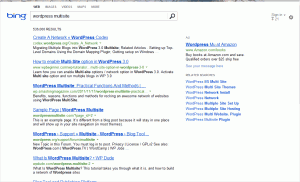
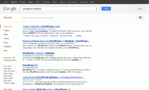
I would guess not many of you have noticed this, since much of our audience probably regards Bing as a joke, but the team over at Bing has redesigned their search results pages. The page is now much cleaner than it once was, with a true no-nonsense feel. The only items on the page are the search results, one or two ads and a list of related searches.
In addition to cleaning up the overall design by removing all of the color splashes and by moving the related search list from the left to the right, they’ve also removed your search history and the ability to narrow your search results by time period.
Although the page’s color palette now resemble Google more than it ever has before, the actual layout of the page is much more minimal than Google’s current design. Below, I’ve included a comparison of Bing and Google. Both searches were performed within an incognito window, so I am not signed into either service. If you’re interested in more details about the redesign, you can view the official post on the Bing blog.

